
Mi Vodafone is the application to which I’ve dedicated the most hours in my career. During the 8 years I worked at Vodafone, the app underwent a radical transformation, becoming a strategic pillar for the company. The project involved both national and international teams, with multidisciplinary profiles. We can proudly say that we’ve succeeded in building the best telecom app in Spain
TimeLine
Sep 2019- Ago 2024
Team
Design Team
Design Global Studio
IT Development
App Team
Tools
Disciplines
Adapting the app to the new reality of our customers
When a crisis turns into an opportunity

Great App Penetration
Include all key company task to expand our base
More Frequent visits
Create a new interaction model
Increase Brand Love
Redesign to add value to our brand
MVA10 will impact the 3 key pillars of the Digital Telco program
Align and link your design strategy with the business strategy
To implement MVA in the company, we identified the business benefits that the new model brought and linked each new feature to these objectives. This approach made it much easier to justify and secure any necessary investments
Increase revenue through sales
TO
New Opporitnities for CVM
Enriched e-commerce functionality
WITH
Easier payment journeys
Flow ‘pull’ experience
Increase customer satification
TO
Winning moments of truth
WITH
New Converge Services
Is Everything Ok reassurance
Magical Moments
Reduce cost to call centers
TO
Predictive billing experience
WITH
TOBi Concierge
Proactive Notifications
With clear business objectives in mind, I participated in a working group tasked with defining an interaction model that would align with the new use of the app. We assembled a team based in London and held workshops where we shared usage data from different markets. This allowed us to…
Usage trends
To conduct a performance estimation exercise for the app, we analyzed the usage trends of each feature and projected which new areas we should focus on. The data is indicative, but it's based on current decline trends and areas of interest identified in previous user studies

We defined the foundations of the experience that will guide us throughout the entire process
DESign PRINCIPLES
Having a clear ambition and target audience from the start is essential when you need to align multiple teams with different goals, concerns, and visions for the project
To create the design principles, I organized a workshop with all the key stakeholders in the organization: Marketing, Brand, IT, and other critical areas that would later support us in defining and launching the project. The goal of the workshop was to raise the ambition and identify principles that everyone felt proud of, under which it would be easier to overcome any obstacles.
DESIGN PRINICPLES Links with Vodafone DNA
Know Before i Know
Useful, Usable
Bring the network to life
Desirable, Useful
Community Spirit
Inviting, Useful
Encourage Discovery
Desirable, Optimistic
Celebrate small things
Desirable, Optimistic
Make it personal
Useful, inviting, Partner
Always ready to help
Useful, Partner

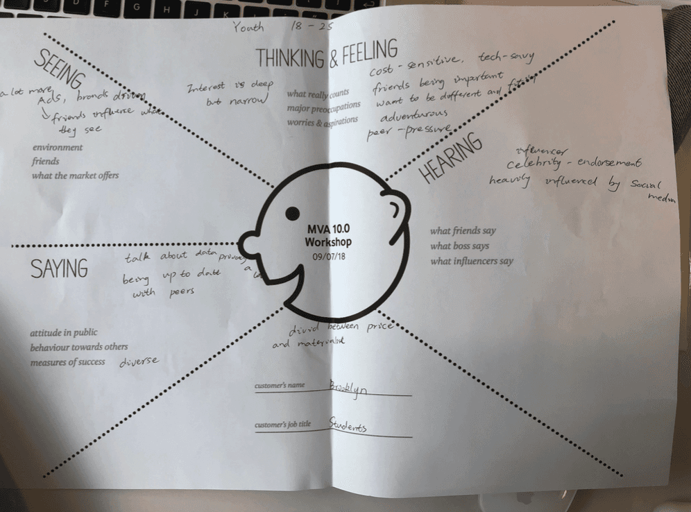
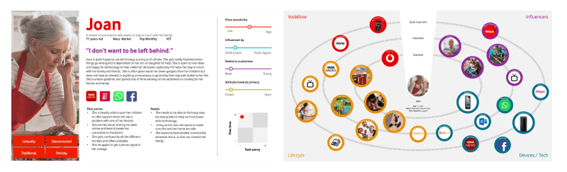
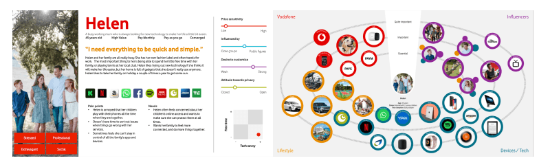
USER PERSONAS
Create your user personas based on market data
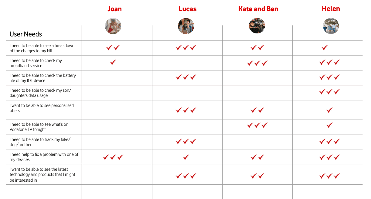
We developed a user persona map to keep our potential customers in focus, detailing their most-used features, competitor references, and needs for future app functionalities. Each market contributed insights about their customers, including perceptions of Vodafone and their self-presentation. We then created a matrix for each persona to capture their free time and technological knowledge.
Template for creating different drafts of user personas
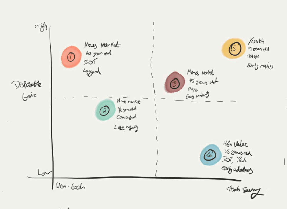
Placement of the different customer segments on the matrix

Matrix: Free Time - Tech Savvines


VISUAL EXPLORATION exploration

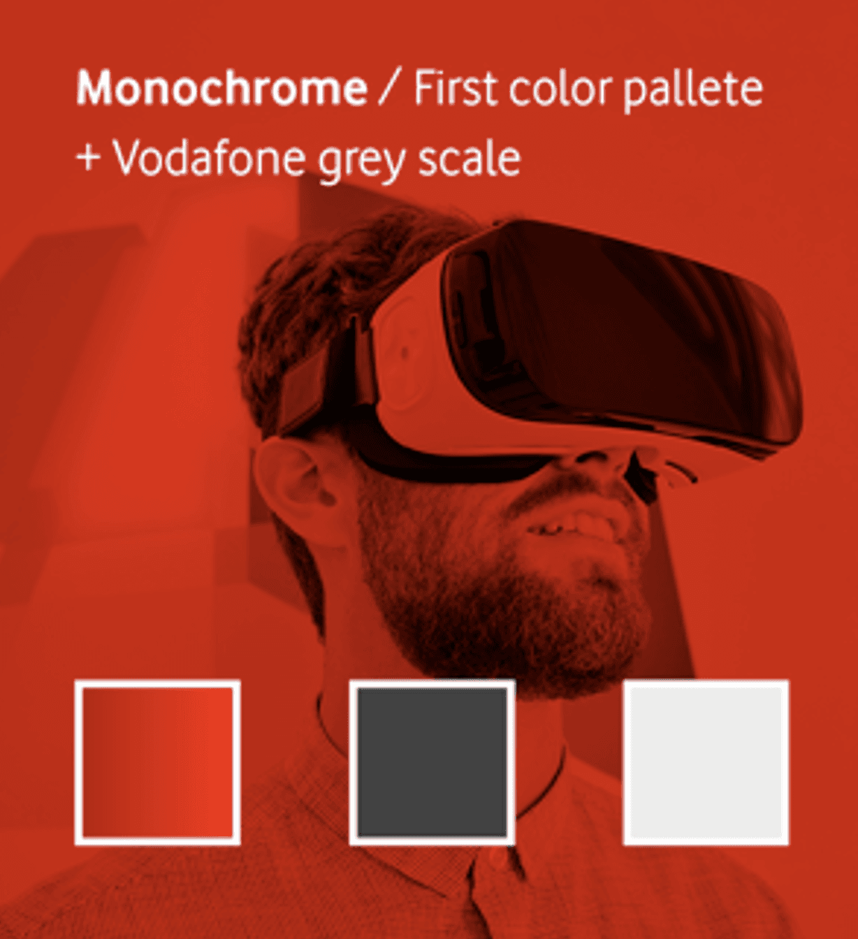


MVA10 new visual style defined in 4 sentences
Exploration 1: Fluid
Exploration 2: Essential, Displaying only what is key to our users

Exploration 3: Branded

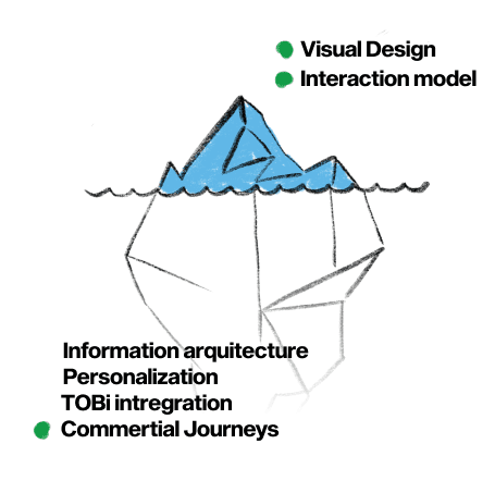
Organize, oversee, and create the best possible experience within the budget and constraints we face
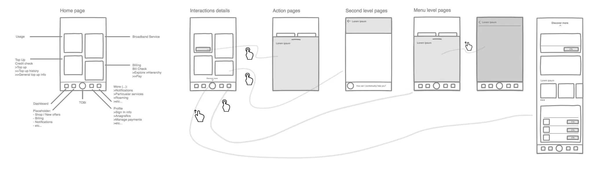
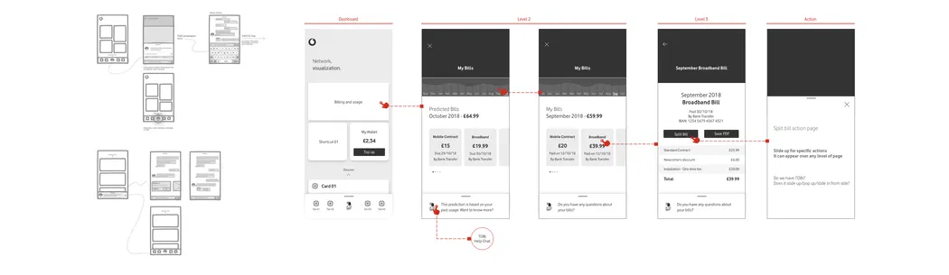
SITEMAP
Organizing the various components for our users
We compiled all the existing sections of the app along with the new ones needed to support the new strategy. Centered around the app's dashboard, we organized the sections into blocks and tested how easily users could find each one.
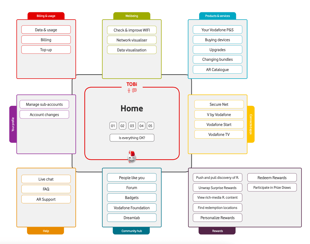
Primer Draft de SiteMap para MVA10
A dynamic model
Since we have different types of users, we proposed a fixed organization that facilitates content discoverability while adding a touch of personalization to the dashboard. This approach highlights the features we know are most useful for each user type. For example, we created two models: one for Joan and another for Lucas, representing the most distinct user profiles
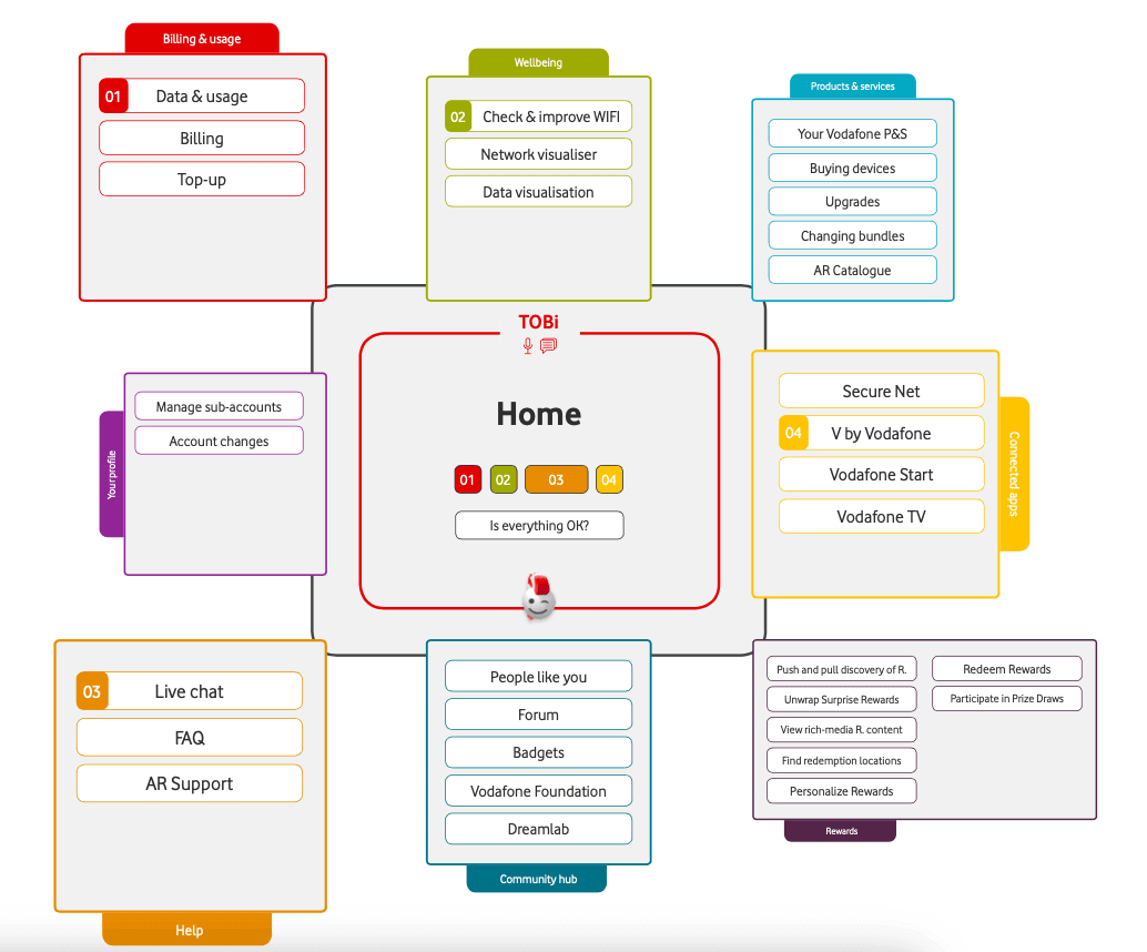
Site Map de Joan co más foco en ayuda y wellbeing
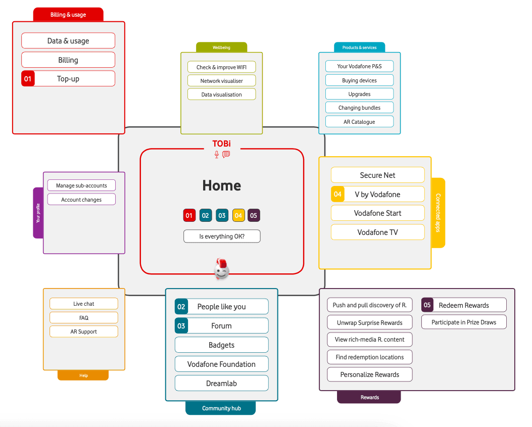
Site Map de Lucas con foco en regargas y community
INTERACTION MODEL
Three model to test
We created a scenario with four interaction models arranged in a matrix, ranging from conventional to more innovative, and tested different models to generate user engagement.

From the most conventional and familiar for our user personas to the boldest and most experimental
Hook OPPOTINITIES
Choose the interaction model that allows you to achieve the most objectives
We designed several ways to create engagement hooks within the app using the interaction models. This allowed us to test them and select the most effective one.
Community Hook
Utilize the interaction model to encourage users to engage with community-based content, thereby increasing their time spent in the app
People like you HooK
Use proactive notifications to compare service usage with others, encouraging ongoing comparisons
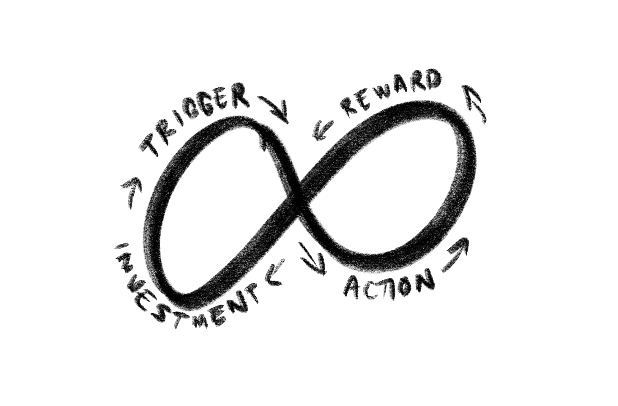
Things that matter hook
Use the app as a control center, allowing users to manage their devices and subscribed services, thereby creating peace of mind

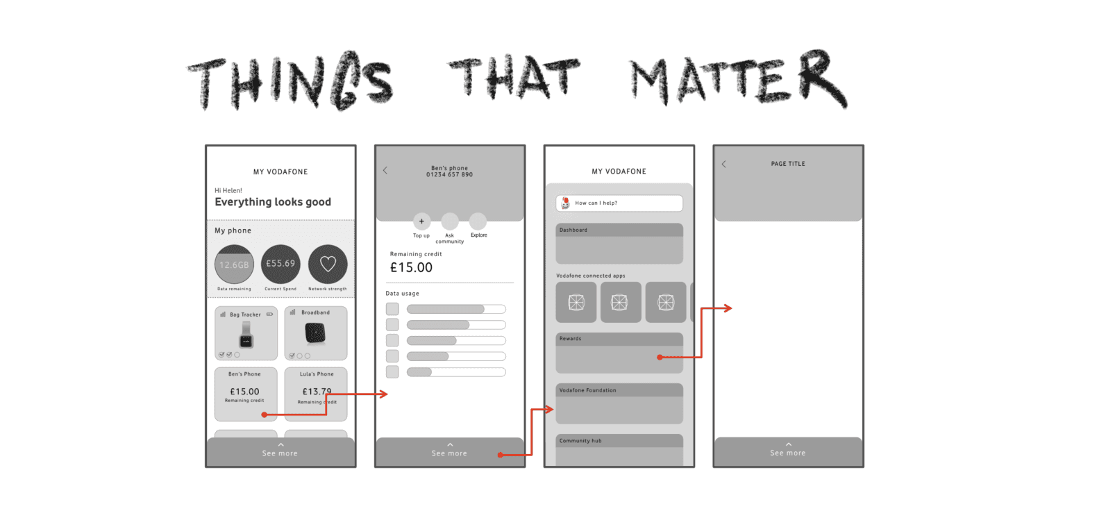

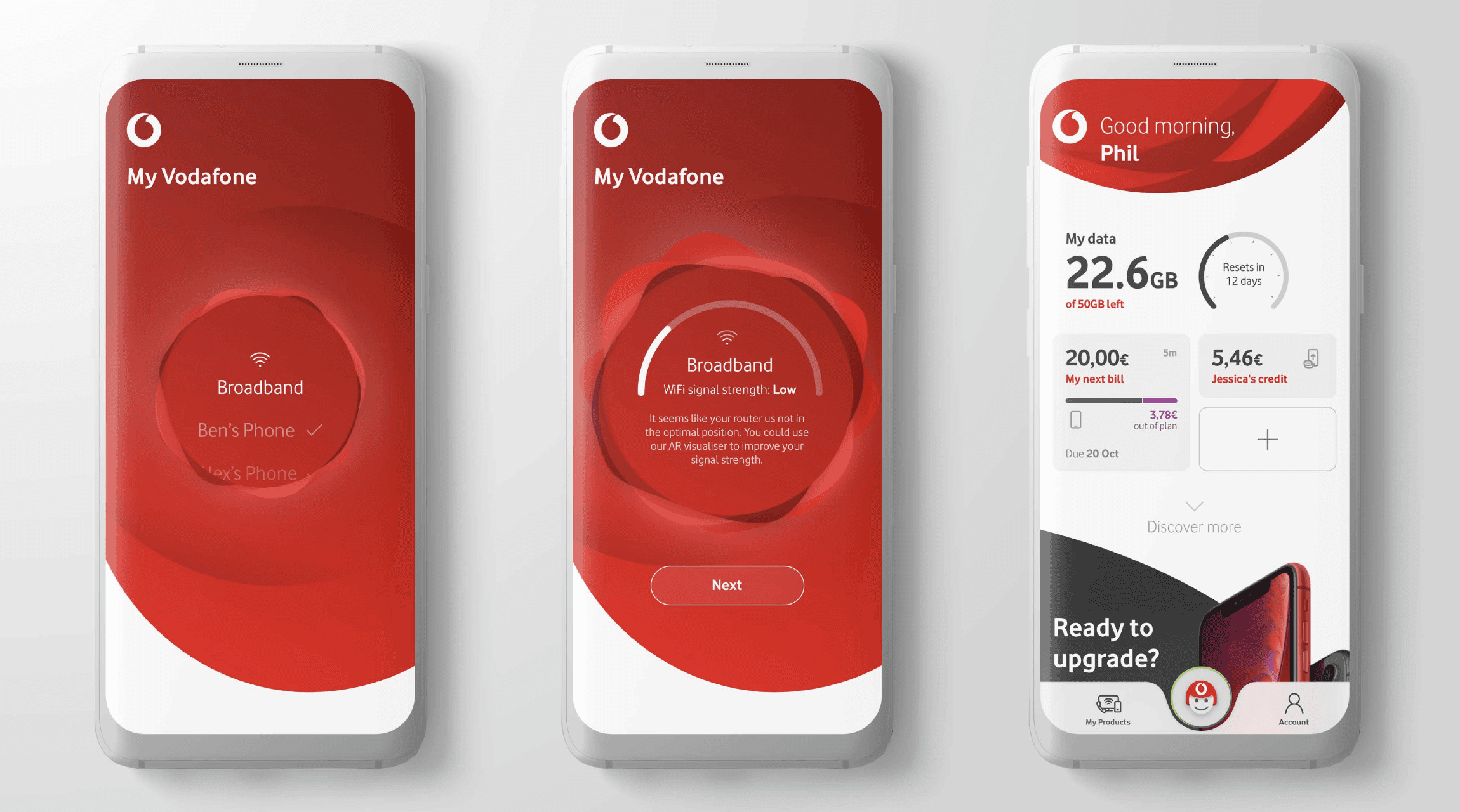
After this exercise, we found that the 'Things That Matter' hook resonated strongly with users, leading us to implement a feature on the dashboard called 'Everything Is OK.' This serves as a notification center focused on the concept of peace of mind

The power of visualization
I created a series of these simple interaction videos which allowed me to maximize buy-in and alignment among the different teams working on the project. Once the interaction model was defined, each team was able to explore spefic key jobs-to-be-done.
MVPs are just the starting point, so we need to incorporate learning and product features that allow the product to truly shine
Planning, Designing, Creating, and Testing

DESIGN SPRINTS
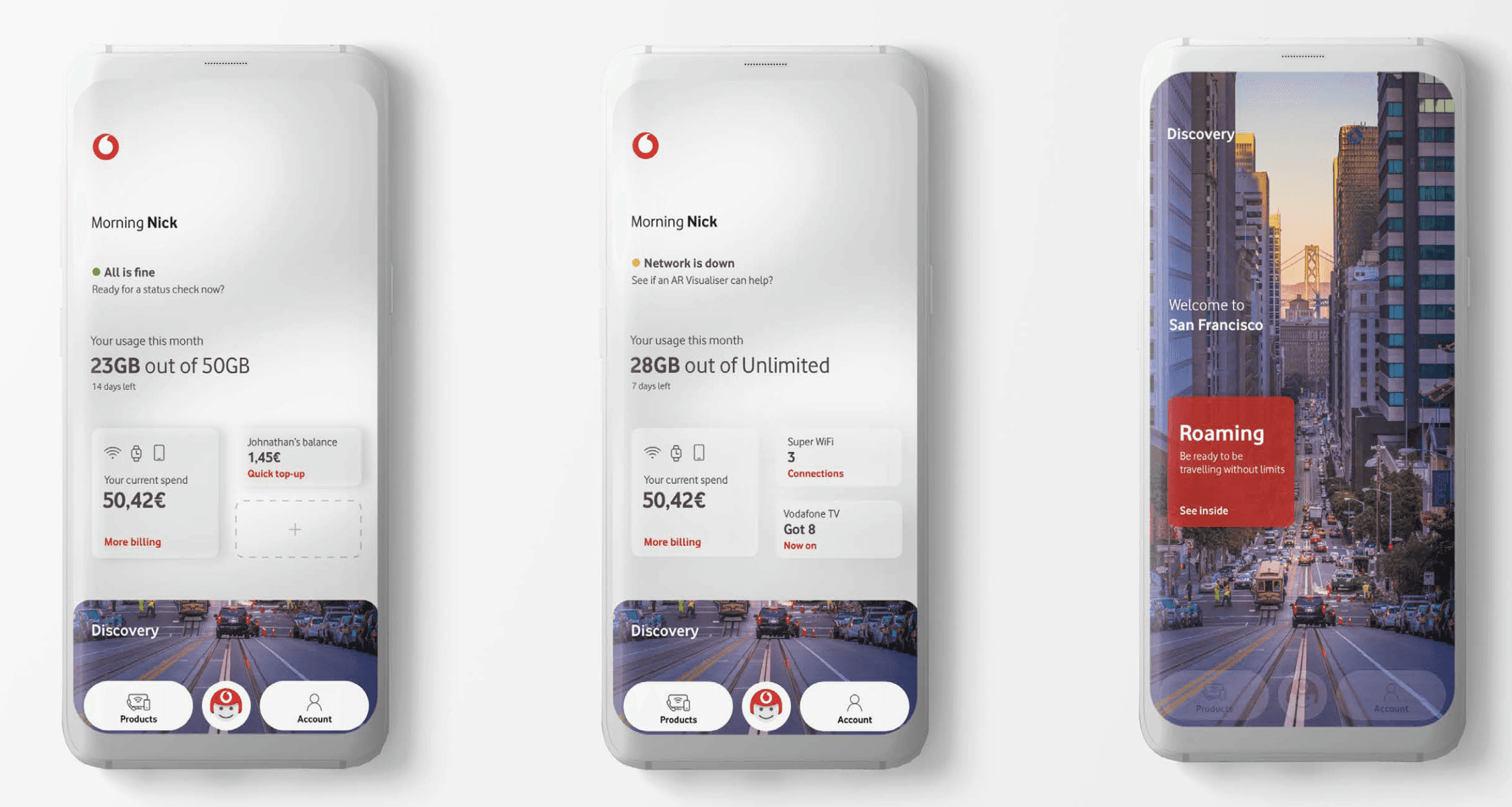
Dashboard
Utility tasks as drivers of revenues
Dashboard tiles give an instant, ‘at a glance’ view of usage, billing and product information.
Clickable tiles are fully personalised and can be customised to meet user lifestyle needs.
Users are encouraged to scroll vertically to explore offers and other tailored content without tapping
even once.

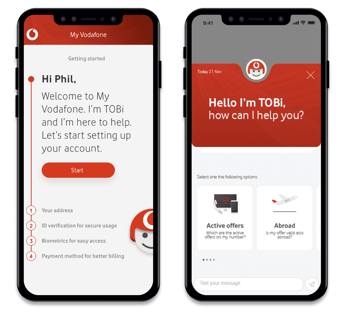
Onboarding, ChatBot & Notification
The distinctive ‘cutout’ tray navigation bar is the anchor point for quick access to products and
account information.
TOBi leads the help and support experience. As he matures, TOBi will act as digital concierge and become central to the experience.
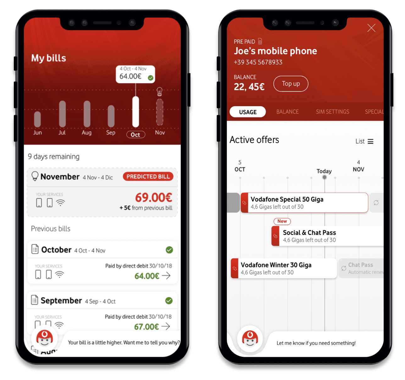
Bill & Usage
New timeline feature was well received at user testing.
Users are able to see their predicted bill based on current usage.
Bills now cover multiple services on a single view.
Data graphs are interactive.
Unlike MVA2.0, Products & Services page contains all relevant information in a single view.
A new opportunity to up-sell in context.
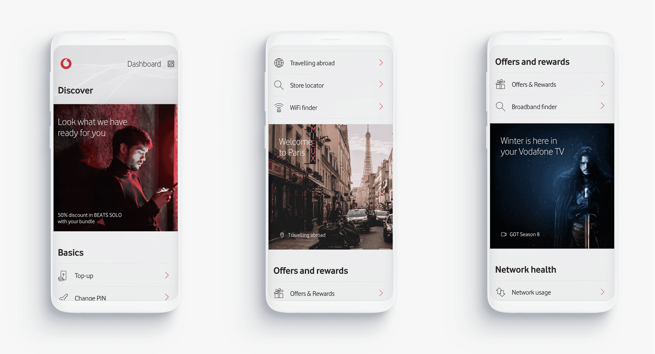
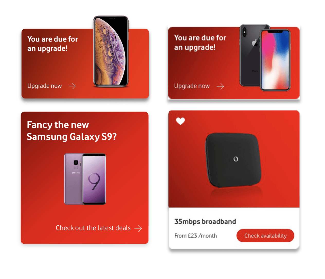
Offers & Rewards
A personalised offer or message always appears ‘above the tray’ on the dashboard to entice users to explore the content below.
Offers always contain clear Vodafone branding.
Offers are always the largest single form of content in the Discovery section.
‘Special offers’ rise out of the rectangle to provoke curiosity and break the otherwise symmetrical experience.
Users are encouraged to scroll vertically to explore offers
and other tailored content without tapping even once.
Utilities
Deliberately functional in appearance, users can easily identify utilities as something useful.
Utilities appear after the first offer card to allow users get to where they want to quickly.
Utilities are listed according to their frequency of use in MVA2.0.

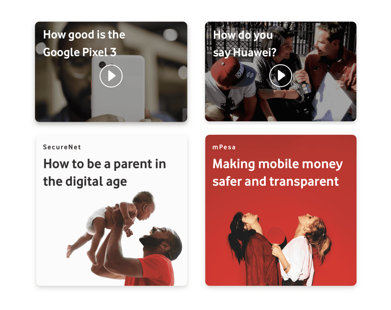
Editorial Content
Vodafone is well placed to have a view on the latest phone
and tech products.
Users would be interested to hear Vodafone experts give their review of the latest handsets or explain the latest developments in IoT.
Adding editorial content presents an opportunity to offer more lighthearted content.
Autoplaying video content could help bring the Discovery area
to life.
Adding content beyond offers reinforces Discovery as more
than a ‘sales area’.
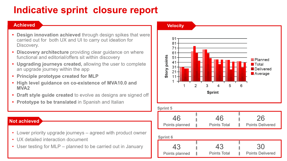
We test all completed designs to identify pain points and address them in the next sprints
Example of testing with one of the designed journeys

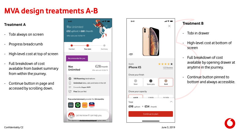
How to make the app redesign feasible within budgetary and technical constraints
Phased Strategy
Prioritize Quick Wins and prepare the path for a complete migration
One of the most impactful factors on customer satisfaction and retention was the construction of the new dashboard, which felt like a complete redesign.
This would encourage many customers who had stopped using the app to return.
Additionally, we were set to launch new commercial journeys, making it crucial to align everything with the new design.
We organized all functionalities by their business impact and consulted with the development teams to estimate the time and resources needed. Following a beta launch, we gradually deployed the remaining functionalities
Re-Style Quickwins


Después del lanzamiento entramos en una fase de incorporación mejoras y testing continuo
ESTRATEGIA DE FASEADO
Test to improve performance
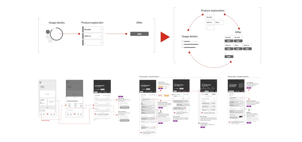
Despite the successful launch of MVA10 in Spain, we aimed to enhance our objectives. We noticed the Discovery model with offers was becoming complex, leading to too many entry points for customers.
To improve traffic to the commercial journeys, we consolidated all entry points into a carousel and created a dedicated section after discussions with the teams involved.

Aprendizajes y reflexiones
The final product doesn't have to be 100% identical to what you originally conceptualized
The product must evolve by adapting to constraints
Take your time to lay the foundations
It’s important to focus a designer's intuition on product and business objectives.
Business objectives are king
We create a product to achieve specific objectives; anything that diverts us from these goals must be eliminated, no matter how much effort it took to create it.
Working with data is essential if we want to fail less
Use all available data to verify and extract insights; without them, the design lacks meaning
Technical constraints are part of the journey
As designers, we must seek solutions that meet technical constraints; if we can't adapt to them, the design is just a PowerPoint presentation.
Prioritize, organize, and adapt
Business and user priorities change. Keep your design process flexible and create a model that can adapt to any setbacks